Professor Fiona Ross has designed revolutionary fonts that have been used to communicate to millions of people across India and throughout the world. She now lectures at the University of Reading, and often calls on former Reading students to work with her on major international projects.
An illustrious career in typeface design

Falling in love with Indian literature
Fiona joined the Department of Typography & Graphic Communication with 17 years of experience in the typographic industry. After graduating with a degree in German, Fiona's fascination with language and literature led her to study the ancient language of Sanskrit, from which many contemporary Indian languages are derived. It was through her Sanskrit studies that she fell in love with Indian literature.
“I found that the literature and scripts of India were always so beautiful but poorly represented in type. I never really felt their publications did justice to the literature.”
Rising through the ranks at Linotype
In the late seventies Fiona began working as a Research Assistant for Linotype Limited, the British arm of the company that had created the original Linotype machine and its many successors.
During her time at Linotype, Fiona progressed through the ranks, taking over the management of the Letter Drawing Office and liaising with newspaper companies and offices in South and South-East Asia and the Middle East.
"I was incredibly fond of my time at Linotype. I liked the ethos that the designs produced were always underpinned by proper, extensive research.”
Revolutionising Bengali-script typeface design
Working with Indian markets led Fiona to embark on her later works with Indian scripts. The first script she worked on as a designer was Bengali.
Fiona worked alongside fellow type designer Tim Holloway to design a typeface for Anandabazar Patrika, a popular Bengali newspaper with a daily circulation of over 1 million readers today.
"At the time we found that the initial font designs were poor, hampered by hot-metal technology. In comparison to Latin, there was still a real lack of sufficient high-quality fonts available. We collaborated on creating a new typeface for the newspaper."
This revolutionary typeface design would not only go on to define Anandabazar Patrika’s tone of voice, but was also adopted as the seemingly ubiquitous Bengali-script typeface in India and Bangladesh. It is even used to portray information on airport signage in Kolkata.
Several decades later, the publishers of Anandabazar Patrika commissioned Fiona to design a low-contrast font for their forthcoming newspaper Ebela. This newspaper was designed to appeal to the more casual reader on the metro, similar to tabloid newspapers in the UK.
The new font was called Sarkar. Ebela's first edition with the new design was released on 31 August, 2012, on the streets of Kolkata.
Collaborating with Reading graduates
Fiona believes collaboration lies at the heart of all her professional work and often calls on her own former students to feed into her projects.
“One such collaboration was on a project for Microsoft, who were receiving complaints about the user interface fonts for their Indian scripts. For this, John Hudson (of Tiro Typeworks) and I collaborated with a team of former University of Reading students, who had been working in professional practice for at least three years.
"Our creation has been shipped as the default user interface font for Windows in India ever since Windows 8.”
Creating purposeful, beautiful fonts
Throughout her career Fiona has placed importance on fonts having a purpose and being useful to the reader as well as looking aesthetically pleasing.
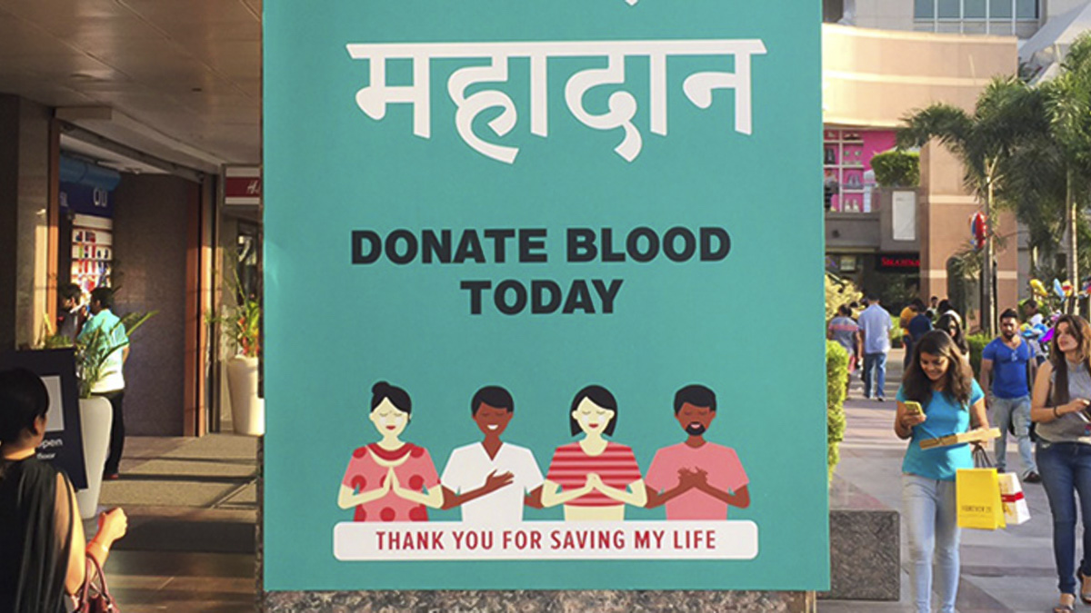
In 2009, Fiona collaborated with Tim Holloway to create Adobe Devanagari, a font commonly used for marketing and branding purposes across India. She also recently worked with John Hudson on fonts in six Indian scripts for the Murty Classical Library of India.
Fiona's work on non-Latin scripts continues to be used across the world today and she firmly believes her work and research is fed by her teaching and vice-versa.
“Typeface design is incredibly important for visual communication and dissemination of information. There are still insufficient typefaces to meet the needs of many linguistic communities, and my work strives to help facilitate a response to this insufficiency.”
Professor Rick Poynor

Our staff
